A Guide to the 8 Most Common Web Design Mistakes Small Businesses Make

Designing a website is easy. But, creating a website that is beautiful, impressive, and user-friendly is another story.
Many small business owners understand the importance of their website. Your site is often the first impression a potential customer gets of your brand online. As a result, you want it to look great, be easy to navigate, and encourage sales.
A small business owner will most often contract out the new website project to a small business web design company. These companies are experts and can build a website faster and better than you probably ever could. However, even a small business web design company can make common design mistakes.
Whether you're going to hire an agency for your website design or attempt it yourself, you must know the most common web design mistakes out there.
By educating yourself, you can ensure your final product won't have any of these tragic mishaps.
We've compiled a list of the eight top web design mistakes we see for small business websites all the time.
.gif)
1. Your Homepage Doesn't Make It Immediately Clear Who You Are & What You Do
When someone lands on your website for the first time, they should be able to tell within seconds what the name of your company is and what it is you do and sell.
It takes about 50 milliseconds for a website to make an impression on a user before they decide to leave. And, your users visited your site for a reason.
As soon as they land on your website, you need to verify that their reasoning was correct. If they thought they were looking at a local flower shop, you need to make it clear you're a flower shop in their area offering floral services from the start.
Take a look at our homepage for a great example of making your business and branding clear from the start.
2. Navigation is Hidden Or Confusing
Users want to be guided through a website. So, websites should be built with a natural path in mind. As someone scrolls through your website, they can be directed to new paths and areas with different CTAs, like downloading a free ebook or checking out your latest seasonal product list.
One way to ensure your users can easily find what they're looking for on your website is with a navigation panel. Your navigation panel should be easy to find and at the top of your website. It also shouldn't be overwhelming, with too many choices. A navigation panel should be split up into clear, differing categories.
If a user can't easily navigate through your website, they are more likely to become irritated and leave it entirely.
Before launching your website, test your navigation out on some users who have never seen the website. Watch their experience to see if they find everything they're looking for quickly or struggle throughout the site.

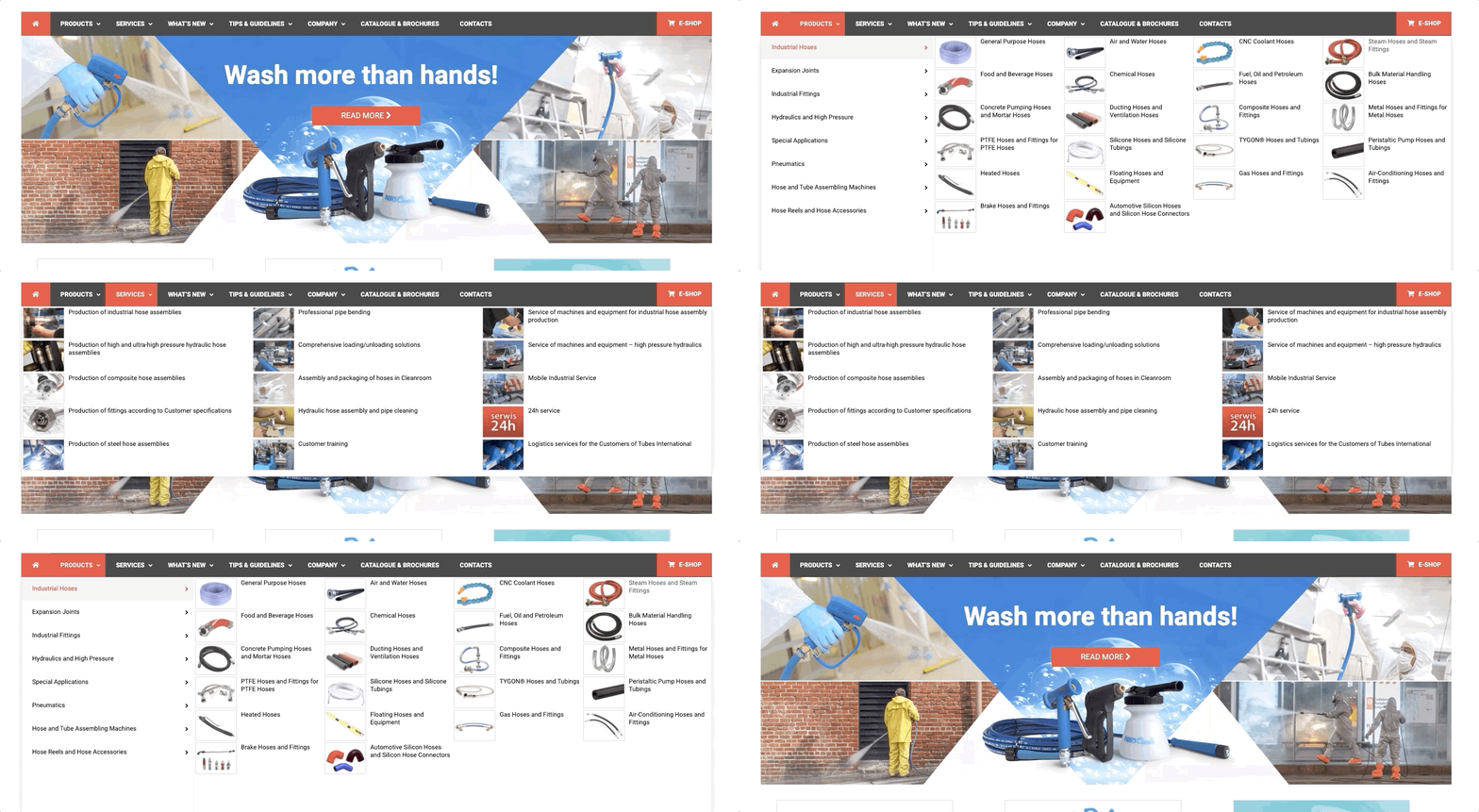
Would you rather use this site?
or
This one?

The easier your main menu is to use, the more people you'll keep engaged on your site.
3. No Search Functionality (or Bad Search Functionality)
Sometimes, when a user doesn't find the site navigation to be working for them, they'll opt for the search bar. Whether you believe your navigation is straightforward or not, make sure you always have a search bar.
But it doesn't stop there.
Your search bar actually has to work well. We've all experienced being on a site and searching for something you know is on there, but the search bar tool won't show you what you're looking for. It only makes for a frustrating user experience.
After creating a search bar, make sure you test it to ensure it works for key phrases that should turn up results on your site.
4. Not Mobile Friendly
Approximately 52% of global internet traffic comes from mobile devices. While this is common knowledge to many people, some people still design with only the desktop experience in mind. This is a huge mistake.
Depending on your industry, half or more of your website traffic could be coming from a mobile phone. If your website isn't mobile-friendly, then a large portion of your potential audience has a less-than-spectacular website experience.
According to Google, 61% of users will not return to a mobile site if they had trouble accessing it. And, 40% of them will head to a competitor that does have a mobile-friendly website instead.
Ensure that you're creating a website with responsive design. A responsive design automatically adjusts the screen size that the user is on - tablet, mobile, or desktop. You can also test out if your website is mobile-friendly with Google's Mobile-Friendly Test.

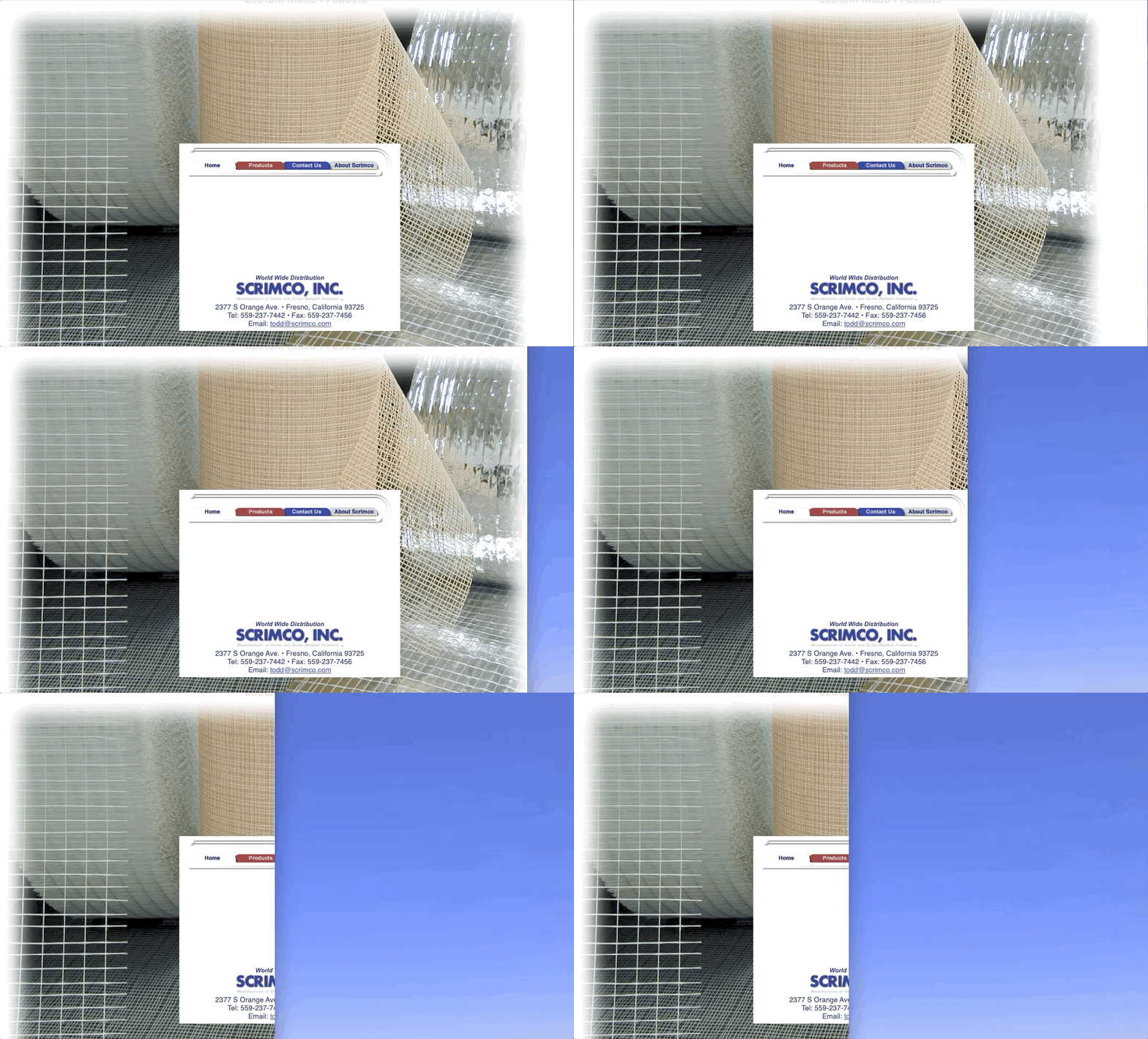
Not only does this website look dated, it also doesn't adjust to a smaller screen. What's that translate to? The user missing valuable information when navigating from a phone.
5. Your Website Takes Too Long to Load
You often hear the phrase "today's fast-paced world." Well, when it comes to website loading times, that phrase rings very true. Approximately 47% of people expect a site to load in two seconds or less. And, 40% of people will abandon a website that takes longer than three seconds to load.
Your website speed is closely linked to your conversions and sales revenues too. Other companies have tested this and found it to clearly be true. For Walmart, every one-second improvement in page load time resulted in a 2% increase in conversions. And for COOK, a reduction in page loading time by 0.85 seconds resulted in a 7% increase in conversions.
You should test your website speed before and after you launch. Ideally, you want to keep loading speed below three seconds.
6. CTA is Hidden, Unclear, or Too Overpowering
Ultimately, every page on your website should have a CTA encouraging an action from your user that will benefit you. Your CTA (call-to-action) can vary from page to page, including email sign-ups, filling out a form for a free resource, or purchasing an item.
Your CTA should follow a few rules:
- Should clearly tell the consumer what they're getting (i.e., It doesn't say: "Want free products and free newsletters? Sign up now.")
- Shouldn't be too small to read or too large that it overpowers the screen.
- Should pop up at the appropriate time. For example, you wouldn't want it to pop up three seconds after they've landed on the homepage.
- Tells users what they'll need to do.
Even after you launch, you'll want to continuously A/B test your CTAs. This will allow you to optimize it, changing its styling, coloring, or wording to encourage the highest conversion rates.

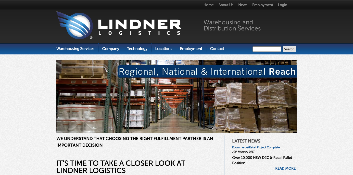
Do you see an obvious call to action here? Us either.
7. Contact Information is Difficult to Find
A lot of times, users want to contact a business directly. This might be to ask for information they couldn't find on the website, place a special order or booking, or to complain. You want to give people contact information so they can reach out to you. Otherwise, they may get frustrated and take to your review pages instead as a roundabout way to reach you.
It's typical to include a link to a contact page on your top or bottom navigation panels (or both).
8. Not HTTPS Secure
Ultimately, you want people on your website to purchase items or make bookings for services. This requires that they put in sensitive personal information, including payment information. Websites that are not HTTPS secure are not safe and don't protect the customer's data. Most browsers will highlight to users that a website is not HTTPS secure.
If you don't take the time to handle your website's security, you will lose out on most sales. Or, you're at risk of having customers be upset with you because they believe their personal information was stolen from your website.
Your customers are your livelihood, so you must protect them by having a safe and secure website.
Agency Jet: The Premier Small Business Web Design Company in Minneapolis
This list is just the beginning of website design considerations that must take place when creating a new website. Unless you're a professional, experienced web developer, it's likely best to hire a small business web design company.
Agency Jet builds websites that not only look great but perform well too. Our experienced team of web designers knows how to deliver on client expectations and take pride in thorough testing to ensure the website launch goes smoothly.
Contact us today for your free website assessment to learn how your website can be improved.
More Resources